| Author |
Message |
|
cloaked_wolf
What's a life?
Joined: Thu Apr 23, 2009 8:46 pm
Posts: 10022

|
I'm not particularly arty-farty and hence need some advice. I'm creating a practice intranet and figured it was time to update the design. The current one is very green (green menus, green menu text) and very busy (too much stuff, almost none of which is used these days). So I'm planning to redesign it. Current: 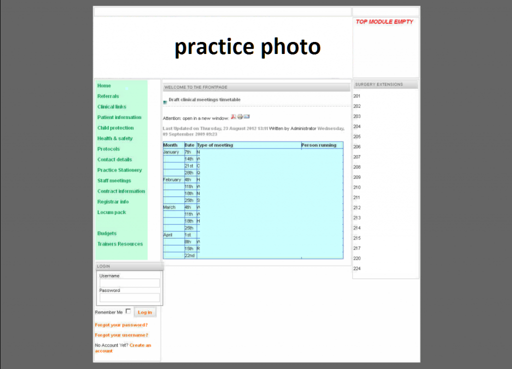 Planned design and colour scheme 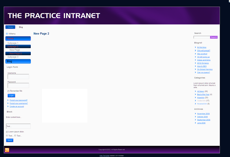 I need ideas. I thought of a purple banner, which blue menu links/headings and black text elsewhere. Active menu links would be red. However, on reflection, it just doesn't work. So I'm trying to rack my brains on colour schemes. Any suggestions? _________________ He fights for the users. He fights for the users.
|
| Thu Dec 06, 2012 7:07 pm |

|
|
|
steve74
Doesn't have much of a life
Joined: Fri Apr 24, 2009 12:43 pm
Posts: 1798
Location: Manchester
|
The red text on cyan background makes it hard to read for me - if I looked at that for too long it would give me eyestrain - I'd try going darker blue/purple for the button so that you can have the links in white (see the "login" button further down the page, the white text is much easier to read - though the cyan is still too vibrant for my tastes).
Nothing wrong with keeping it simple layout-wise - it's hard to say how this will look when the real content flows into the main area. Do you have a few sample articles that you can try out in that area? There's nothing like a real-world example to show up any weak areas in a design! Remember, you can make it idiot-proof, but all that happens is a bigger idiot comes along and messes it up somehow!
Can you perhaps buy one of those ready-made templates off t'internet? Or maybe a Wordpress theme? Or are you hand-coding this?
_________________
* Steve *
* Witty statement goes here *
|
| Thu Dec 06, 2012 7:30 pm |
|
|
|
cloaked_wolf
What's a life?
Joined: Thu Apr 23, 2009 8:46 pm
Posts: 10022
|
Okay so how about making the active text white? Yeah did wonder whether it was too light a shade. There's a calendar that will go up. The rest, we've decided, will be links to documents that will open as a DOC/PDF/IMG (or if I can be bothered, posted as an image). The documents are either referral forms, or clinical pathways. The old intranet basically was a repository for information so everything was a link to a word document, PDF or an image. This is going to be very basic, which is why I need to get the design right. I'll make some changes and then post up some sample work. With the old intranet, the practice manager was able to add articles (eg new guidelines) but she never has time for it so it will be something I will do. This is essentially my baby! I'm creating this in Joomla and used Artisteer to create it. _________________He fights for the users.
|
| Thu Dec 06, 2012 8:54 pm |
|
|
|
steve74
Doesn't have much of a life
Joined: Fri Apr 24, 2009 12:43 pm
Posts: 1798
Location: Manchester
|
Trying not to change the structure you've already set up, what about this...  and for the calendar page...  Purples and greys work quite well together. On their own, purples can look a bit heavy but the grey helps to lift it. As for other colours, try to let the images you use add interest. Try to keep the text styles to a minimum - a main headline, article subhead and paragraph subhead, along with the main text style and maybe a pull-out quote style too? Oh, and ban them using Comic Sans!
_________________
* Steve *
* Witty statement goes here *
|
| Thu Dec 06, 2012 10:16 pm |
|
|
|
ProfessorF
What's a life?
Joined: Thu Apr 23, 2009 7:56 pm
Posts: 12030
|
That colour scheme reminds me of any number of educational establishment's corporate colours.
|
| Thu Dec 06, 2012 10:30 pm |
|
|
|
cloaked_wolf
What's a life?
Joined: Thu Apr 23, 2009 8:46 pm
Posts: 10022
|
HAhahaha! That's very close to what I've done: 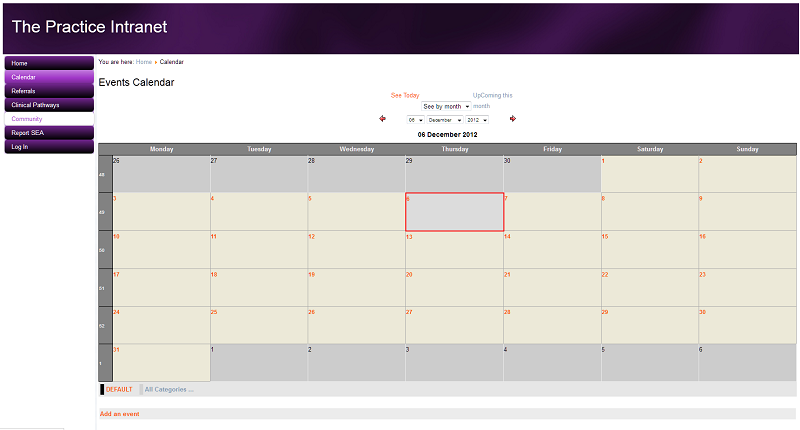 I've gone for more white/purple but do wonder whether grey would have been better. Where did you get that template design from? _________________He fights for the users.
|
| Thu Dec 06, 2012 10:32 pm |
|
|
|
steve74
Doesn't have much of a life
Joined: Fri Apr 24, 2009 12:43 pm
Posts: 1798
Location: Manchester
|
It's just done in Photoshop, I worked over your low-res snapshot! 
_________________
* Steve *
* Witty statement goes here *
|
| Thu Dec 06, 2012 10:36 pm |
|
|
|
timark_uk
Moderator
Joined: Thu Apr 23, 2009 6:11 pm
Posts: 12147
Location: Belfast
|
Like this?They provide the whole of the IT infrastructure for the primary and post-primary education sector over here. Mark
|
| Thu Dec 06, 2012 10:38 pm |

|
|
|
cloaked_wolf
What's a life?
Joined: Thu Apr 23, 2009 8:46 pm
Posts: 10022
|
This confuses me. Did the prof make a post and delete it or was that a quote from another thread? My eyes are beginning to cross so am going to sleepsies. Frustratingly, I did something really clever with an article in Joomla (created a page with tabbed areas for page breaks) but I can't get it to work again. Does my colour scheme look too purple? Should I turn it down, introduce more grey or change the whole thing to blue? _________________He fights for the users.
|
| Thu Dec 06, 2012 10:43 pm |
|
|
|
timark_uk
Moderator
Joined: Thu Apr 23, 2009 6:11 pm
Posts: 12147
Location: Belfast
|
The Profs post is still in this thread. I think it's a good call you going to bed right about now. (8+) I like that colour of purple. Alex was merely making an observation, which I backed up with an example. I think the purple background of the link images is a bit much. It looks like too big a block. Perhaps change the link text to purple and the background to a more neutral colour? Either that, or reduce the opacity of the purple? Mark
|
| Thu Dec 06, 2012 10:53 pm |
|
|
|
oceanicitl
Official forum cat lady
Joined: Fri Apr 24, 2009 8:04 am
Posts: 11039
Location: London
|
Loving the purple
_________________Still the official cheeky one 
|
| Fri Dec 07, 2012 11:22 am |
|
|
|
cloaked_wolf
What's a life?
Joined: Thu Apr 23, 2009 8:46 pm
Posts: 10022
|
Not sure what happened. I slowly scrolled up and down on the laptop to find his username and avatar but couldn't see it. Went to bed and whilst there, had a quick look on the iPhone. Spotted it straight away. Apologies to the Prof for missing his post. I've tested out the template on the computers at work and they just aren't vibrant enough so everything looks like a very dark purple. I now plan to lighten it up to a colour similar to what steve74 did. _________________He fights for the users.
|
| Fri Dec 07, 2012 2:07 pm |
|
|
|
cloaked_wolf
What's a life?
Joined: Thu Apr 23, 2009 8:46 pm
Posts: 10022
|
So do the girls at work, one of whom was wearing a dress in the same colour as my purple site! _________________He fights for the users.
|
| Fri Dec 07, 2012 2:08 pm |
|
|
|
jonbwfc
What's a life?
Joined: Thu Apr 23, 2009 7:26 pm
Posts: 17040
|
Strangely it's very similar to our corporate branding. To quote from our 'visual identity guidelines'
|
| Fri Dec 07, 2012 2:48 pm |
|
|
|
cloaked_wolf
What's a life?
Joined: Thu Apr 23, 2009 8:46 pm
Posts: 10022
|
Updated: 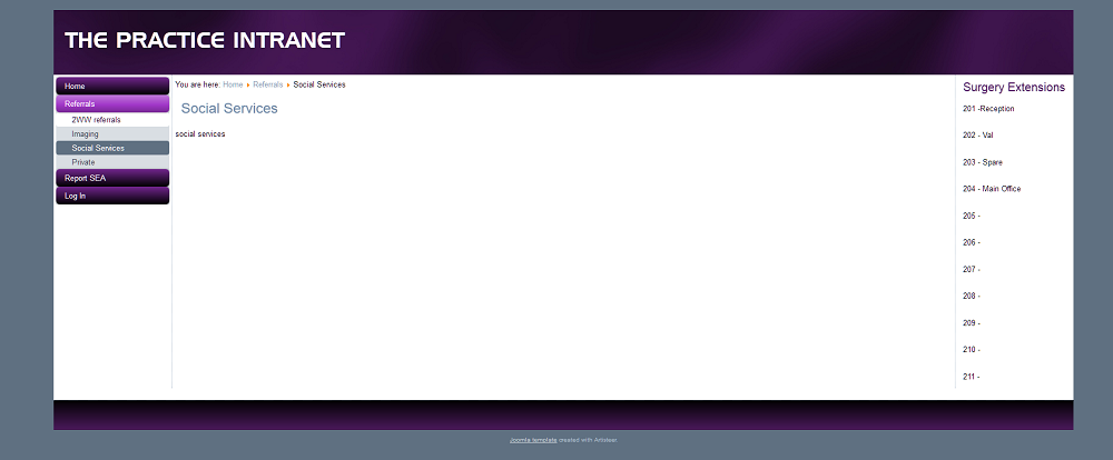 _________________He fights for the users.
|
| Mon Dec 10, 2012 10:20 pm |
|
|